SHARI'S BERRIES BRAND TRANSFORMATION
This gourmet-dipped strawberry brand was due for an overhaul. Its look was dated, and overdone. Fresh photography, a bright new brand persona and campaign integration helped take this e-commerce business to double-digit year-over-year growth in the years to follow.
the beginning.


If it ain't broke...
...fix it anyway.
This is a story of an acquisition brand that—with little brand love—seemed to be performing well in market. It was a differentiated product offered on a well-optimized e-commerce website. The category was growing, the product was unique, and the quality was suberb. Why change what's working?
Through market and consumer reasearch, it was determined that Shari's Berries lacked brand "stickiness". It wasn't distinct in the market place. Consumers were confused: was it Godiva, masquerading in the dipped fruit category? The brand felt stuffy and overly sophisticated for its low-prices and high-promotional nature. What did it stand for? Decadence at a discount? Proven an unsustainable proposition, Shari's Berries was poised for a rebrand.
How could we reinvent this brand in a way that was low-risk, low-cost, would resonate with new customers, yet not alienate the loyalists? Turns out, there were some low-hanging fruit.
photography
you eat with your eyes.


The photography for the Shari's Berries brand needed a refresh, in a big way. Not only were the shots flat: lacking dimensionality, compositional interest and a clear focal point—but this gourmet food brand was missing appetite appeal and a visual indulgence factor.
Creating "yum"
These side-by-side images feature the same product SKU, before and after. By focusing on texture, color, and ingredient-cues, we were able to transform the product presentation on site. The new photography showed higher conversion and accessory-attach rates and was rolled out to the broader portfolio.


These images show side-by-side comparison of old and new photography. We chose to highlight the texture and detail of the product—rather than show piece-count—in order to show value to the customer.
look + feel
fresh, bright, modern.


Lighting, composition and photo-styling played a crucial role in the new photography approach to the brand. The mood is light and cheerful, without sacrificing any of the decadence and appetite-appeal.

We then got to work building out the rest of the brand expression including: color palette, font family, graphic elements, patterns and a custom iconography set.


Finally, we delivered Shari's Berries' first-ever brand book, which also included audience profile, brand story, brand architecture, tone & voice, and packaging applications. See full brand book here.
brand first, occassion second.

Shari's Berries is in the gifting category, and as such, highlighting the occasion is an important piece of marketing this brand successfully. However, by developing a brand foundation from which seasonality can emerge, we saw that Shari's Berries could show up to the consumer in a consistent way, and lean into an occasion as relevant, without compromising the integrity of the brand essence. Though perhaps obvious, this was a meaningful shift for the business at the time.
case study summary

brand, transformed.
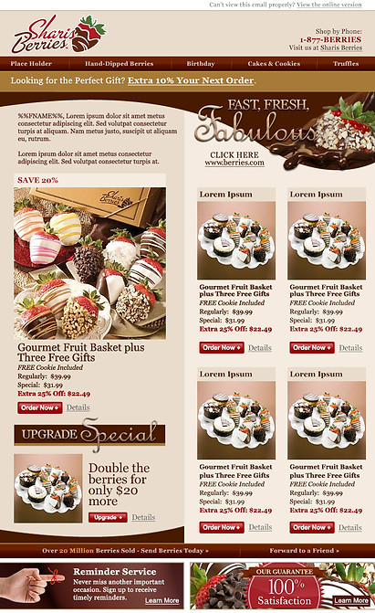
With the brand strategy clearly articulated and creative expression defined, it was easy to create holistic, integrated approach to all consumer touchpoints for any given activation. This included a full rollout across all channels, including: website, email, direct mail, social, and radio and TV mass media, among others.
Shari's Berries now began to differentiate itself in the marketplace and appeal to the modern consumer. The brand saw double-digit YOY growth the next year and trended similiarly over the next 3 years.
